KC Vision Performance brand
Our motivation was to create a visual icon that better demonstrates our three service lines focused around vision performance challenges.
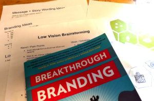
We have taken on creating the concept, design, and launch of our entire rebranding effort in-house. That said, the design process behind such a branding overhaul didn’t happen overnight. We began with exploring the essence of what we do, which led us down a path to unify our messaging. In order to convey a succinct approach to the performance-based vision care we provide, we aimed to create a service mark that represented our three core services originating from our unique, consistent approach — to help patients build vision success.

 The hexagon or honeycomb, is a building block symbolizing strength – the shape can be found in the structure of DNA, our natural environment, and even in the rods and cones of the eye. As part of our rebranding story, we feel the shape also represents teamwork and the strength in collaboration with our referral partners like you and your staff.